Delivery
Visual identity / motion design
Year
2022
Client
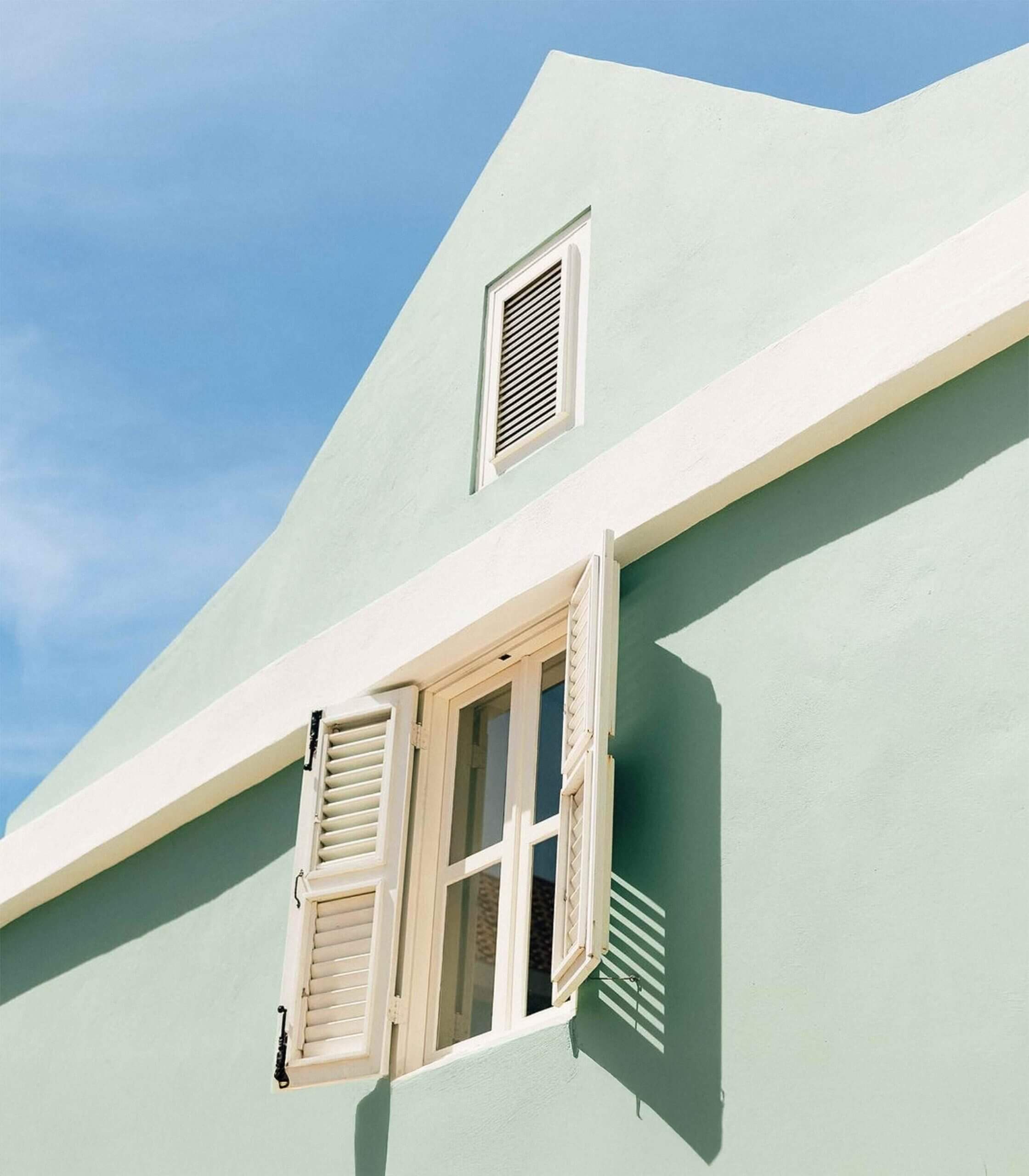
Pietermaai Oasis is a boutique hotel located in the heart of Curaçao’s historic Pietermaai district, a neighborhood known for its colorful colonial buildings, lively streets, and growing list of boutique stays. Unlike many of its neighbors, Pietermaai Oasis offers something special, a hidden courtyard with pool, tropical garden, and rooms that feel like home. It’s a peaceful hideaway in the middle of a vibrant cultural city. The brand needed to capture that contrast.
Challenge
In an area full of boutique hotels, the risk is blending in. The goal was to create a visual identity that stood out without being loud. One that reflected the unique experience of staying at Pietermaai Oasis: personal, serene, and a little mysterious.
Approach
Leaning into the personal, serene, and slightly mysterious is what made the hotel different. The feeling of stepping into a slower pace. The brand would reflect this contrast: the vibrancy of Curaçao outside, and the serenity of the Oasis inside.
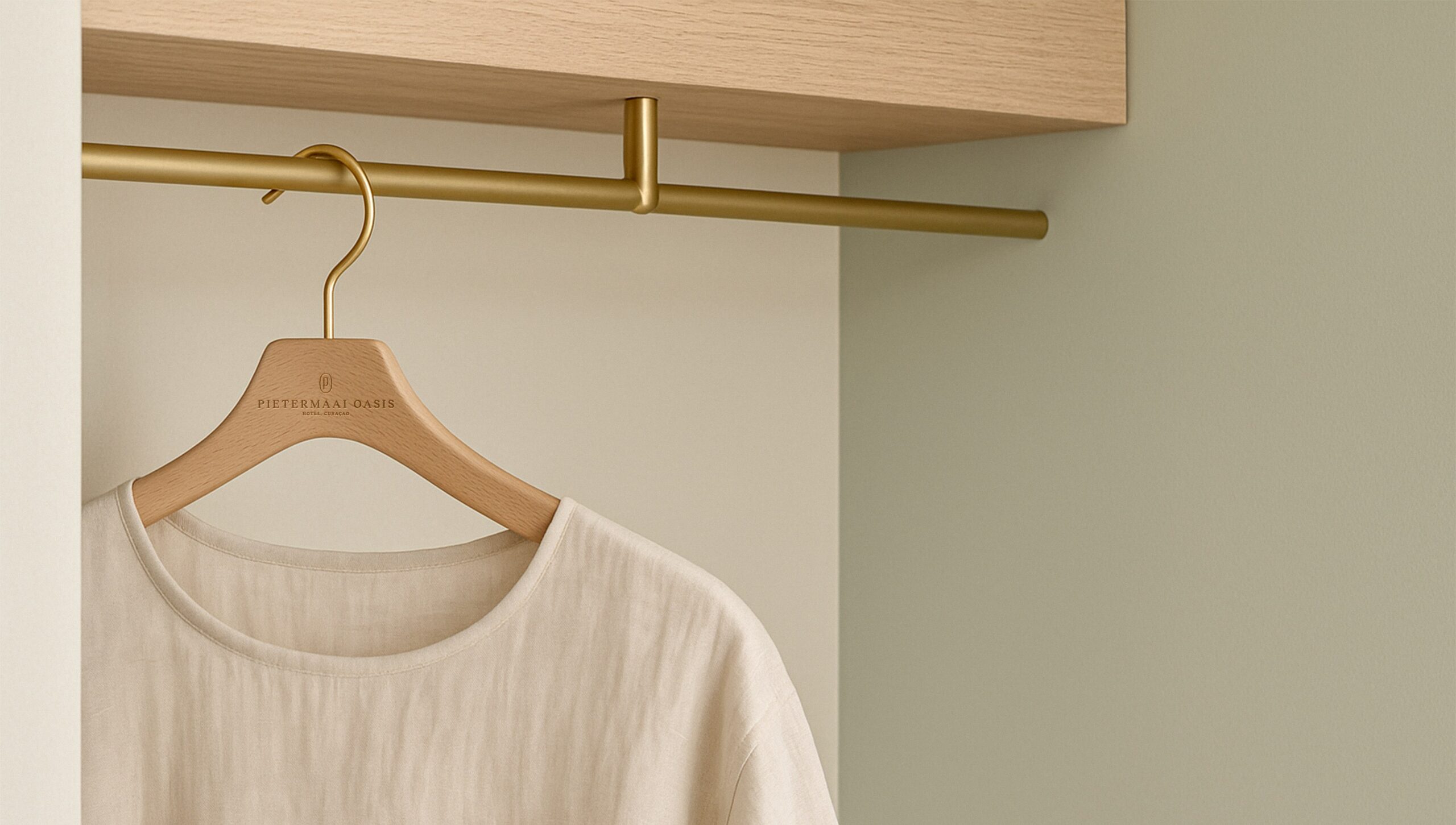
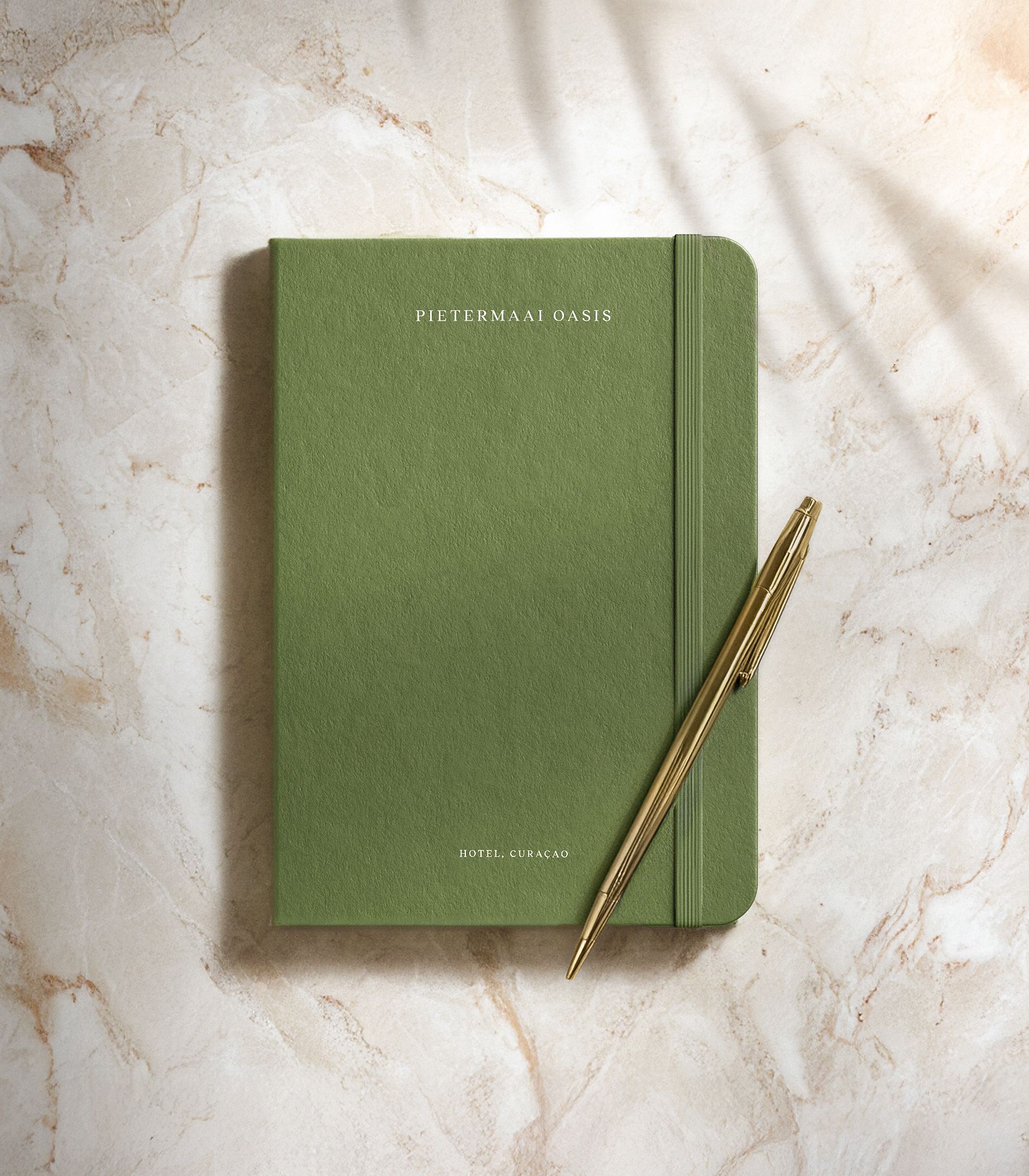
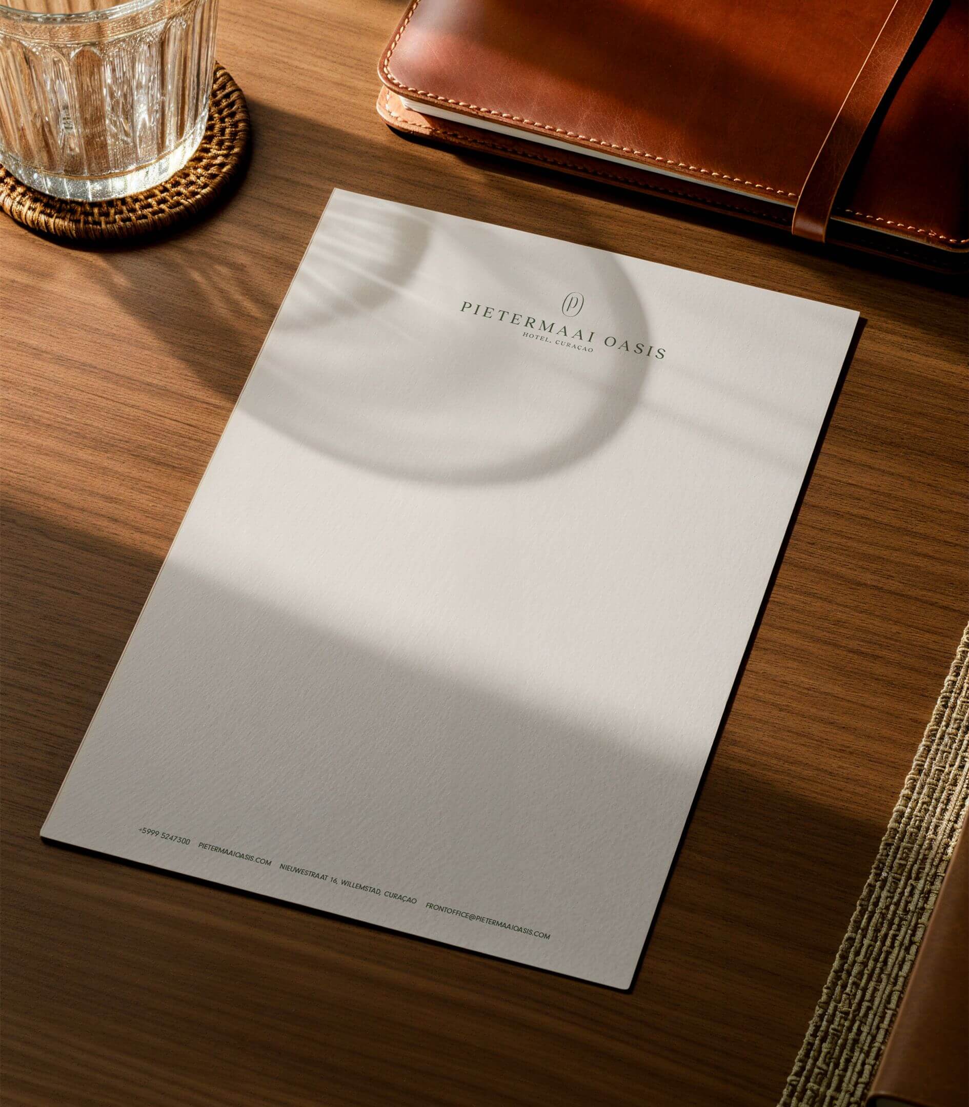
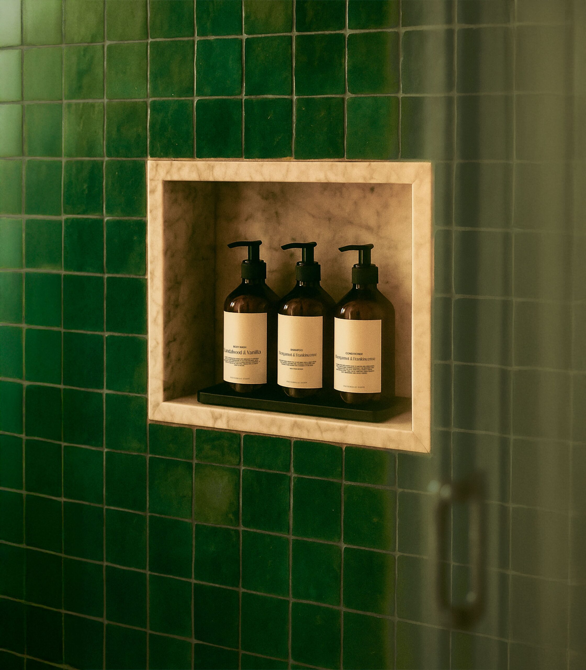
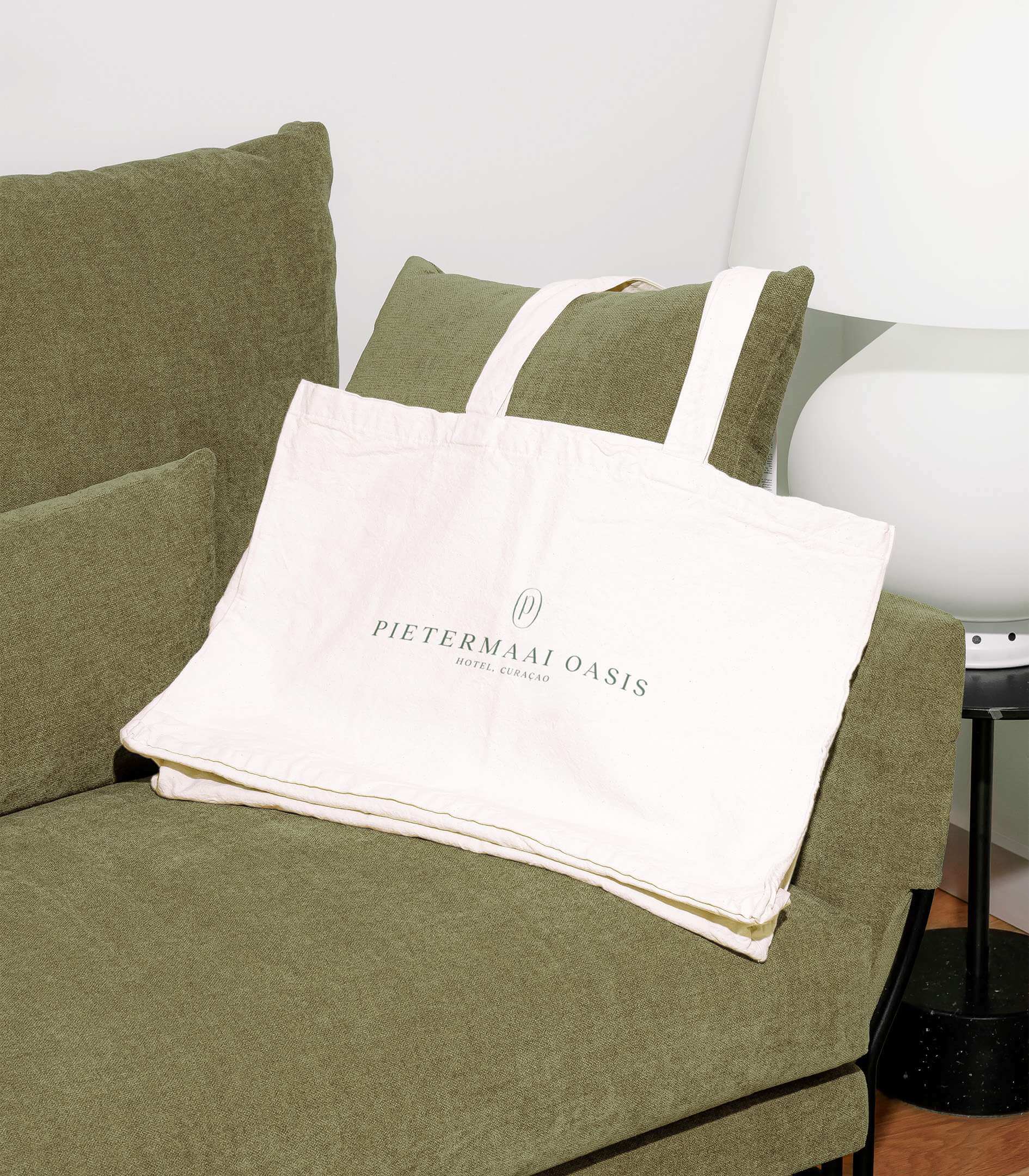
The visual identity was inspired by the island itself. The color palette draws from Curaçao’s nature like vivid skies, white-sand beaches, tropical greens, and golden sunlight. Creating a system that feels both rooted in nature and welcoming to guests.
The typography pairs a bold, modern typeface with a handwritten style to reflect the balance between structure and warmth, adding a personal touch that makes guests feel seen, while subtly nodding to a more high-end, curated experience.
The new identity gives Pietermaai Oasis a clear and confident voice in a saturated market. It positions the hotel as a hidden gem, a place for travelers looking to slow down, unwind, and experience Curaçao in a more intimate way. More than just a logo, this brand tells a story: one that’s deeply connected to its surroundings and designed to be discovered.